
Boss your next website project
When I first got involved in website design projects, there was one key take-out from my research. And it remains as true today as it did when I started.
“Don’t confuse your audience. A confused audience is a lost audience.”
Website UX for marketeers
A website should not be creative at the expense of confusing and frustrating the user.
As designers we strive to achieve new and exciting ideas for websites and Apps, to create cut-through and disruption, to achieve greater brand awareness. But with my UX designer hat on I am always conscious of the main goals of the website and these are often much less creative priorities. Good UX design enhances the user experience, it should not be creative at the expense of confusing and frustrating the user.
How to ensure you get the best UX
The following tips are a guide to achieving just that and as always their priorities depend upon the purpose of the website or App. Read on to learn how to boss your next website project.
Goals and audience. These completely define your site.
1. Understand your goals. Obvious right?
But you would be surprised how many people don’t really think about what purpose their website should serve. Everyone obviously needs one, so no-one bothers to think what it should do. Having clearly defined goals for your websites helps make all decisions much easier to make, because the answer is always what best serves those goals.
2. Understand your audience
This depends upon the purpose of your site and what you are ‘selling’, the more information you have on your audiences the better you can cater for them. How old and educated they are, what language they speak, what device they are on, how often they visit and purchase, these insights will help inform your UX.
Understand what content best ‘greases the tracks’.
3. What’s your path to purchase?
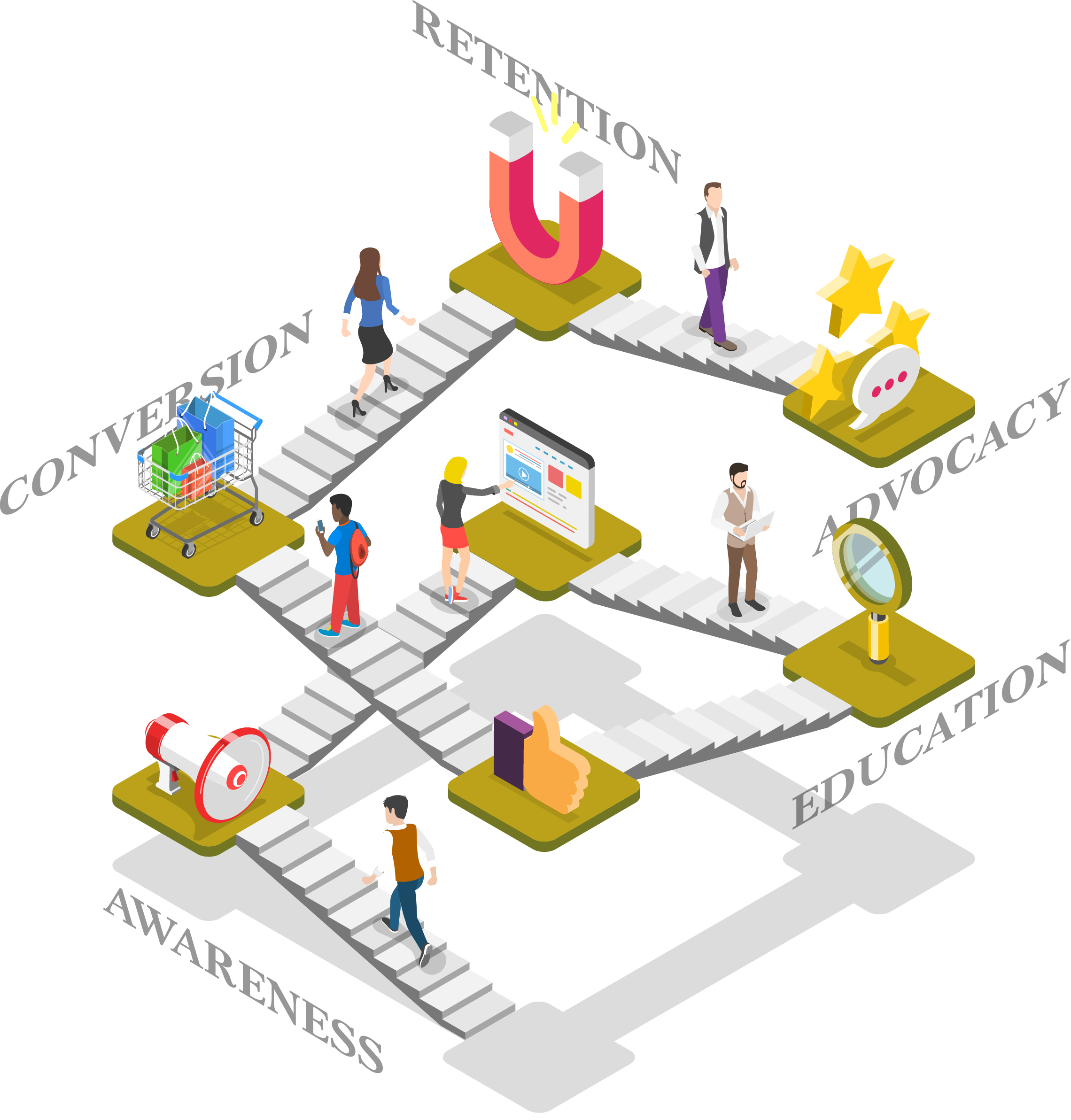
Even if you are not creating an e-commerce website, you will have an end-goal, be it a mailing list sign-up, downloading a brochure or making an enquiry. There is a ‘golden moment’ where the website has achieved its core purpose. We generally consider 5 phases in the ‘path to purchase’ – Awareness, Education, Conversion, Retention and Advocacy. Understanding what content best ‘greases the tracks’ along this path helps to map out your user journey. It is also a great help for planning content creation.
4. Navigation and sign posting. Or belts and braces
Users like to explore in different ways. People are like that. Some are die-hard navigation users, others like to follow their nose and be led by their exploration. This means you need both a well organised menu system as well as on-page navigation. Here we like to develop a hierarchy of call to actions (CTAs). If you have too many CTAs of the same importance, they fight for attention, confuse the user and reduce the effectiveness of your path to purchase. Your site goals will dictate which CTAs are more important than others, then design can help create the hierarchy, so that the user not only finds the path you want them to, but also has options to create their own.
5. Brand versus UX
This is where we find the brand needs to have some flexibility. If your website is more of a brochure site then your signposting can be more subtle and ‘on-brand’. But if you have an e-commerce or lead generation website the CTAs need to be visually obvious and clearly labelled.
All too often creatives and clients want to label content with clever titles, but the user can quickly lose patience if they are looking for something and can’t find it simply. For instance when ‘Contact’ is called ‘Hit us up’ or ‘Let’s talk business’. Be clever and add branding to your descriptive text by all means, but when it comes to directing your audience, K.I.S.S.* is the word.
6. Consistency, consistency, consistency
It’s OK to be disruptive, if that is a core strategic value, but if you want the user to easily find their way through your content, make it obvious how to do it and then be consistent. Users can adapt quite quickly to visual clues and different ways of navigating, but if you chop and change things from one page to another, you will frustrate them and ultimately lose them.
User testing is a must.
7. Test
All too often a website budget doesn’t allow for testing. That’s OK if you have the luxury of time to use analytics and heatmaps on your live site to test, but if you need your site to hit the ground running, user testing is a must. Even after all these years I am still discovering behaviours that are so unexpected and watching how users navigate the bread crumb trail we leave them never fails to improve a website. Experience of behaviour goes a long way, but never over estimate your audience’s ability to read your mind.
8. Use the analytics
It is important to remember, a website is never finished. Browsers, devices, behaviours, your goals, your marketing strategies and your competitors all change, all the time. You need to keep an eye on your analytics and use the insights you gain from the data to improve areas that are not working whilst making more of the areas that are working well.
Review, revamp, repeat.

UX is not rocket science
At the end of the day, UX is not rocket science, but it constantly amazes me how even larger corporations can get it wrong. If you have ever used Microsoft or Google admin portals, you will know what I am talking about. It seems that they fall into the trap of assuming that their audience consists of technical IT specialists and yet they sell their products as simple to use solutions for lay people. So my advice is use what you know, trust your instincts, but don’t make too many assumptions. And when in doubt consult an expert.
Know thy audience and know thy goals and all other battles are won.
Written by Phil Goldfinch Head of Digital at Lime.
For more information on website projects please email Phil.
*Keep it simple silly